After a six-year hiatus, Paramore has returned, sounding as vibrant as ever. Their new album, This Is Why, marks a significant moment for the band and their fanbase. However, the album cover itself has become a point of discussion among design enthusiasts and music lovers alike. While the music signals a triumphant return, the album art prompts a closer look at its effectiveness and design choices.
This Is Why is Paramore’s sixth studio album, following After Laughter released in 2017. The intervening years have been eventful for the band, including lineup changes and solo ventures from lead vocalist Hayley Williams. Considering Paramore’s discography, their album covers have never adhered to strict visual formulas, each release presenting a unique aesthetic.
For many, Paramore’s music was the soundtrack to formative teenage years. Their early album covers, particularly Riot!, captured the energetic and expressive nature of their music. This Is Why seems to echo Brand New Eyes in its use of cream and earthy tones, diverging from other covers except for their self-titled album Paramore, which also features the band members. However, This Is Why largely stands apart in its visual presentation within Paramore’s overall album art history.
The Typographic Debate on “This Is Why” Album Art
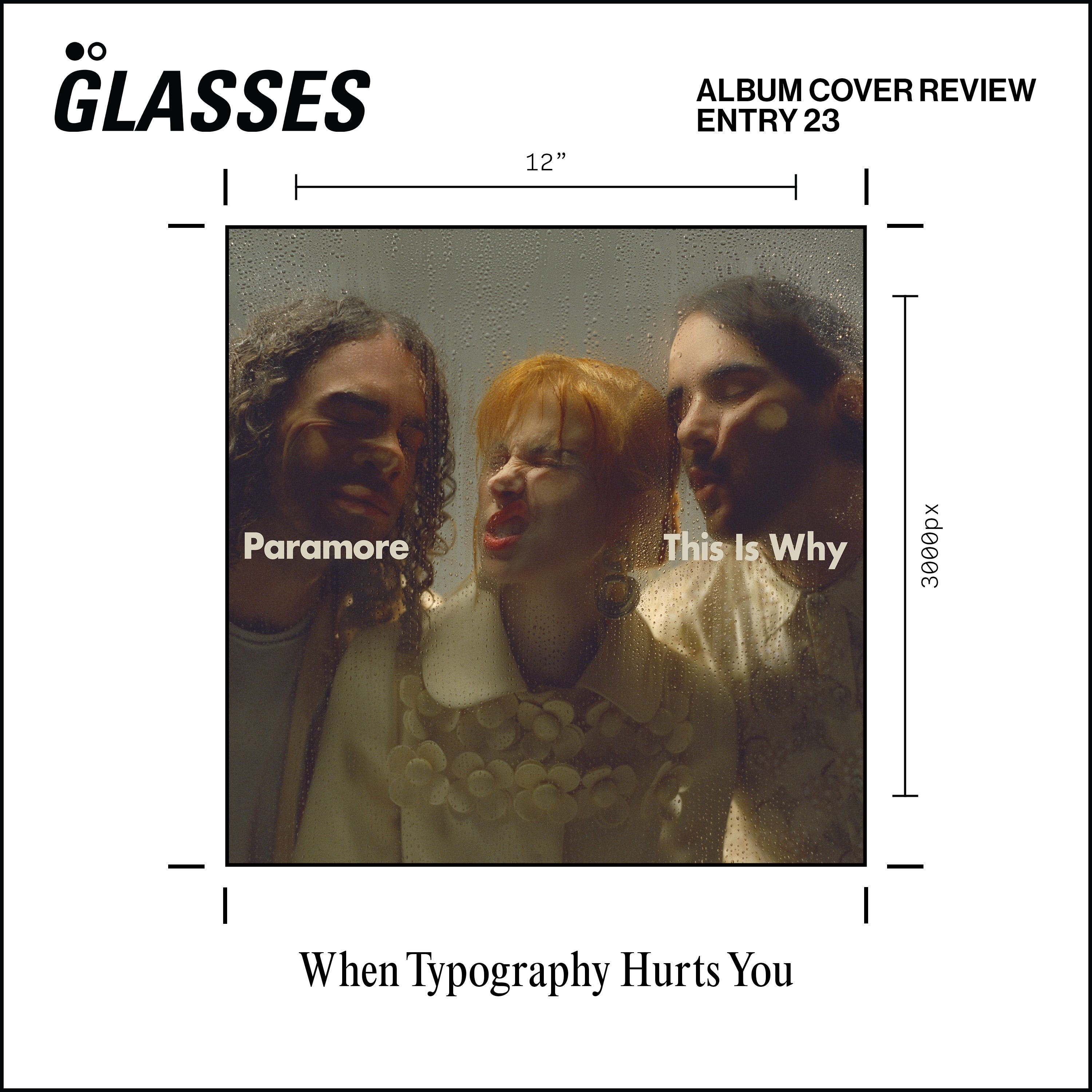
The cover of This Is Why presents a full-frame photograph of the band members with their faces pressed against what appears to be a rain-streaked glass pane. Cream-colored Futura Bold typography cleanly spells out the band’s name and album title across the center. Typography is a critical element in design, and its application on this cover warrants scrutiny. The use of text here might be considered by some as unnecessary and potentially detrimental to the intended visual impact.
In a discussion with Jack McArdle of Studio AAA, a specialist in album art archiving, the consensus was that the typography on the This Is Why cover might detract from the design’s core concept. McArdle suggests that without the text, the image could evoke a sense of the band being observed through a phone screen or even contained within the album packaging itself, creating an intriguing illusion.
“To me, typography on an album cover works best when it enhances, not dilutes, the core visual idea.”
He argues that the text on the This Is Why cover disrupts this potential “fourth wall” effect, making the scene less believable. McArdle proposes a more subtle approach: “If text is necessary, placing it on a sticker for physical copies or utilizing the already present text on digital streaming platforms would be more effective.” A practical approach, such as integrating the text directly into the photograph using Letraset or window paint, could have been a more conceptually cohesive alternative.
The typography itself, designed by FISK Projects, is well-executed in isolation. However, its integration into the album cover photo is the point of contention. Conversely, the photography by Zachary Gray is undeniably impactful. His sessions with Paramore have yielded a series of dynamic and engaging shots that effectively capture the band’s energy.
These alternative shots from the same photoshoot demonstrate the visual strength of the photography and hint at different directions the album art could have taken, with each image possessing the potential to serve as a compelling album cover in its own right.
Exploring “This Is Why” Design Beyond the Cover
Fortunately, one of these striking photographs did find its place as the single artwork for This Is Why.
Again, while the large typography feels somewhat redundant, the inclusion of the Atlantic Records logo at the bottom is a welcome detail. Integrating record label logos more frequently could be a positive trend in album artwork, adding a touch of industry heritage.
Examining the physical merchandise available online, the album posters stand out. Here, the typography placement at the top and bottom feels more balanced and less intrusive, allowing the photographic element to breathe.
The cassette release of This Is Why is particularly appealing. Its clean and simple design exemplifies effective typography usage, where the text complements rather than competes with the visual. The subtle red accents throughout the packaging, also present in the CD version, add a cohesive visual thread.
The initial merchandise line, while standard for album releases, showcases a pleasing cream and black color palette. Hopefully, future tour merchandise will offer more diverse and adventurous designs.
Tour posters for This Is Why maintain a similarly minimalist design approach. The consistent use of Futura Bold is noteworthy and indicative of FISK Projects’ professional design execution.
In conclusion, the visual campaign for This Is Why is largely successful, supporting what is arguably one of Paramore’s strongest albums to date. While the album cover’s typography might be a point of contention, the overall photographic direction and supplementary design elements contribute to a cohesive and aesthetically pleasing package. Whether you find the typography on the cover to be effective or not, the imagery undoubtedly sparks conversation and engagement, which is a crucial aspect of album art in the digital age. Did you grow up listening to Paramore? What are your thoughts on the This Is Why album cover?