Paramore has returned after a six-year break, and their new music is being lauded as some of their best work yet. However, the album cover for “This Is Why” has sparked some debate, particularly among design enthusiasts. While the music marks a triumphant return, the album art presents a curious case study in album cover design.
“This Is Why” is Paramore’s sixth studio album, following 2017’s “After Laughter.” The intervening years have seen band lineup changes and solo projects from lead singer Hayley Williams, making this release a highly anticipated moment for fans. Looking back at Paramore’s album art history, there isn’t a clear visual through-line.
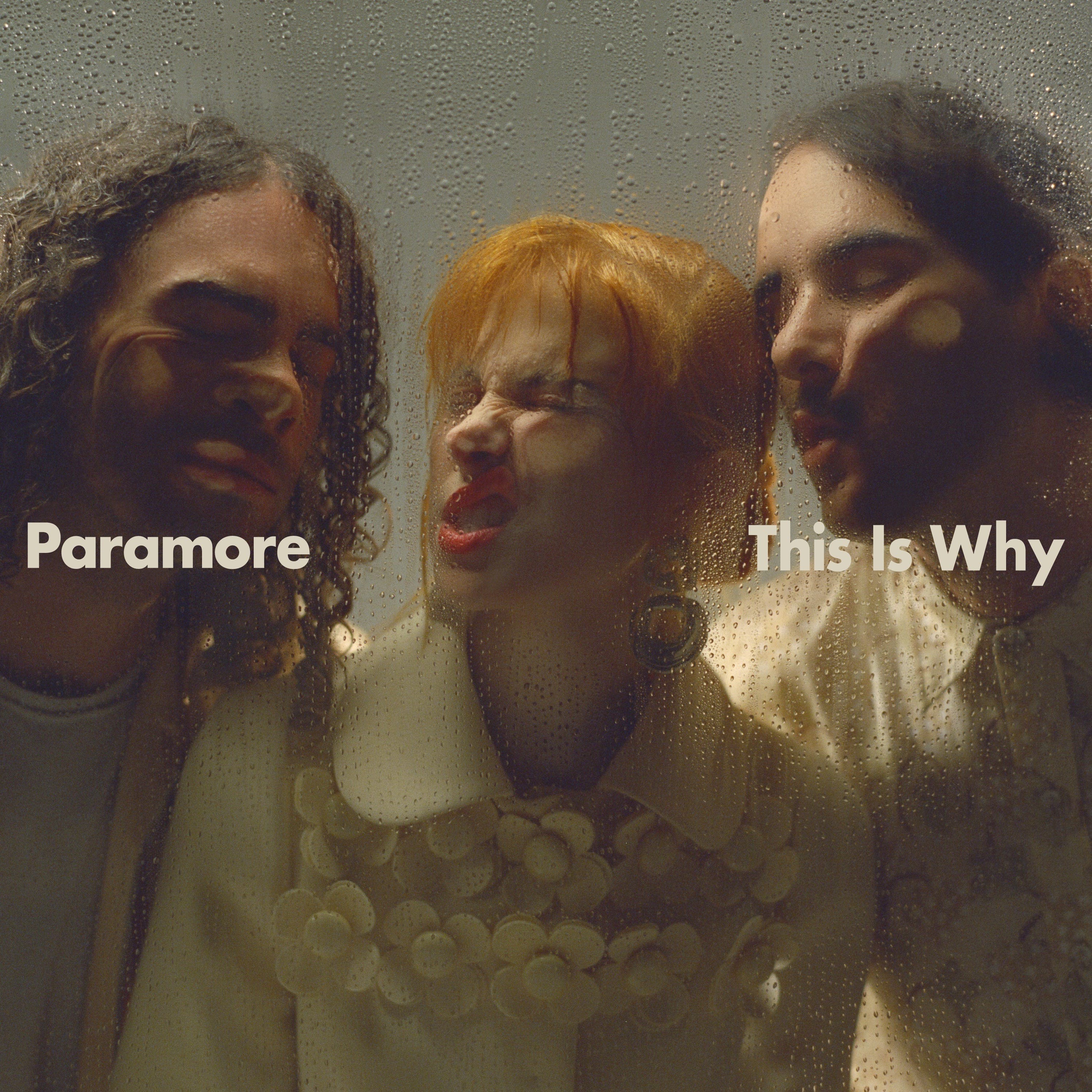
For many, Paramore’s music was the soundtrack to their teenage years. Early album covers like “Riot!” are iconic and expressive, mirroring the energy of the music itself. “This Is Why” shares a color palette with “Brand New Eyes,” utilizing cream and earthy tones. Unlike most of their previous covers, and similar only to their self-titled 2013 album (later changed to feature just Hayley Williams), this new cover features the band members themselves, setting it apart visually within their discography.
The Typography Question Mark
The album cover for “This Is Why” is a striking close-up photograph of the band members with their faces pressed against what appears to be a rain-streaked glass surface. Clean, cream-colored Futura Bold typography spells out the band’s name and album title directly across the center. While the typography itself is well-executed, its inclusion on the cover raises questions about its necessity and impact on the overall design concept.
In a discussion with Jack McArdle from Studio AAA, it was suggested that the typography detracts from the image and would have been more impactful without it. McArdle argues that effective typography on an album cover should enhance, not dilute, the core visual idea.
To me, it’s when it doesn’t dilute the idea.
The initial impression of the cover is that the band is confined behind a screen, perhaps a phone screen or even the album packaging itself. The added text, however, breaks this illusion.
The text breaks the fourth wall, now it’s not believable. If you want text on it, put it on the sticker of the physicals. And for digital, great news—the text is already below it on the streaming services.
The suggestion was made that if typography was essential, a more integrated approach, such as using Letraset directly on the glass in the photograph or window paint, would have been more conceptually aligned. The typography design itself is credited to FISK Projects, known for their strong design work.
The photography by Zachary Gray is undeniably powerful. The outtakes from the photoshoot capture the band’s energy and offer alternative visuals that could have easily served as compelling album covers in their own right.
Design Beyond the Album Cover
Fortunately, one of these alternative shots from the Zachary Gray photoshoot was utilized for a single release cover.
Again, the prominent typography feels somewhat redundant, not significantly enhancing the overall composition. However, the inclusion of the Atlantic Records logo at the bottom is a welcome detail, a practice that could be more widely adopted by artists.
Looking at the physical merchandise available online, the album posters demonstrate a more effective use of typography. Positioned at the top and bottom, the text frames the image without competing with the central visual element.
The cassette release is particularly appealing in its simplicity and clean design. Here too, the album title typography works well without disrupting the visual impact. The strategic use of red accents throughout the packaging, also seen in the CD version, adds a subtle but effective design detail.
Initial merchandise offerings are fairly standard, but the cream and black color scheme is aesthetically pleasing.
Similarly, the tour posters maintain a simple design approach. The consistent use of Futura Bold typography across all materials, a hallmark of FISK Projects’ design, provides visual cohesion.
In conclusion, the visual package surrounding “This Is Why” is generally strong, supporting what many consider to be one of Paramore’s strongest albums. While the album cover photography is compelling, the added typography arguably weakens its overall impact. What are your thoughts on the “This Is Why” album cover? Did you grow up listening to Paramore? Share your opinions in the comments!